Iraq maps: Why reinvent the scrollbar?
During the war with Iraq, many online news sites used interactive maps to display troop movements and battles. I won’t attempt to evaulate the accuracy of these graphics — Eric Meyer and Rex Sorgatz discussed that March 27 on the online-news list — but I do want to discuss the interfaces they used. While print designers regularly created large full-page graphics, online producers were challenged to compress lots of information into the lowest common denominator of 800x600 screen resolution. Some sites invented unique navigation systems for their Flash-based maps rather than using conventions their readers probably already understand, like scrollbars.
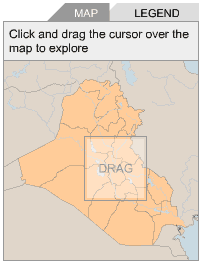
CNN.com’s troop movements map is one of the least intuitive. It tells readers to “use the small map below to move around the large map”:
Nytimes.com’s map uses a slider to zoom in and out on a map originally designed for print:

But the text, which shrinks and grows too, is quite difficult to read at some zoom settings. I also found myself regularly having to drag and recenter to read some blocks of text cut off at a margin.
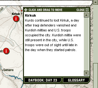
Washingtonpost.com’s day in review map does use a vertical scrollbar, which in my mind is a better interface because people already know how to use it. Readers click icons on the map for text, which appears in a separate area:
But since the Post does not have an overly complicated map like CNN and it doesn’t put text on the map itself like the Times, I’m curious why there is a scrollbar at all. The same information — the base map and the clickable icons — could shrink and display acceptably on an 800x600 screen without scrolling. This is the approach used in usatoday.com’s map, latimes.com’s map, and msnbc.com’s map. Like the Washington Post, all of these maps put their text in a separate area off to the side.
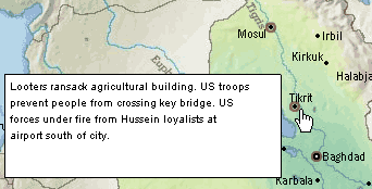
But putting these clickable icons in one place and the text they show somewhere else is not very intuitive either. Readers have to shift focus from one portion of the graphic to another to read the text. Sometimes it’s not even obvious enough that clicking the icon has done anything. The best interface I’ve seen is on the csmonitor.com’s map, which displays “tooltip”-type text when you roll over:
One of the things I like most about working in online news is the fact that the medium is still young enough to require a lot of experimentation — we don’t really know yet what the ideal design is for standard article pages, let alone interactive graphics and multimedia. The number of detailed, professional-looking maps produced on deadline is evidence of how much online journalism has grown in a few years. But we need to learn from our experimentation rather than just using Flash for Flash’s sake. A regular static map is superior to some of these “interactive” interfaces.