It's just in the service of journalism
Earlier when I argued that news sites should regularly change the design of their content area, I was following up on a theory that readers get bored of “sameness” and don’t realize there is much new on a site without new content — and especially a slightly different look for that new content — on the front page.
That’s not the main reason I’m behind more flexible layouts for news site front pages, though. As a journalist, I just want a site’s front page design to be able to accommodate my news organization’s best content at the moment, rather than restrict the type of that content in order to satisfy a static front page design. For instance, the content area of nytimes.com almost always looks the way it did about 10:30 tonight, with a vertical photo on the right side:
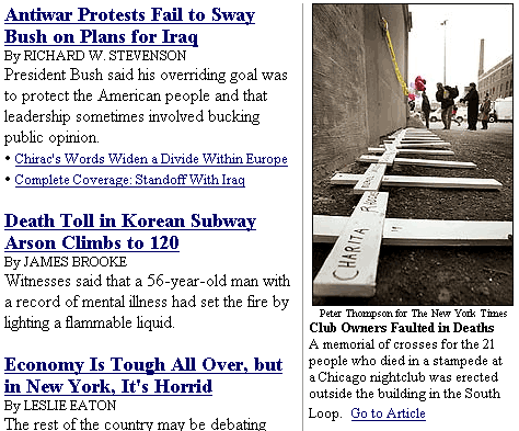
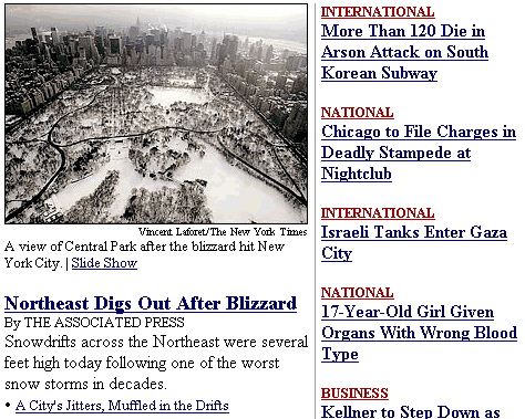
Just two hours earlier, though, the Times was using a strongly horizontal photo of snow in Central Park that would not have retained its impact had it been cropped into a vertical. In order to use it, the site altered its typical front page design, to put the wider photo in a wider column:
This is the exact kind of flexible design that I was recommending. It is in the service of journalism, letting the site showcase its best content. Many people commenting on my previous post asked a very important question: Will a change in the layout of a content area confuse readers? There’s no personal doubt in my mind that the vertical-photo design looks prettier on nytimes.com, but I can’t imagine the switch from one to the other of the above designs will “confuse the hell out of most visitors,” as one person commenting put it. What I can imagine is that most visitors will take a second glance, figure it out, and be exposed to the best photo nytimes.com had to offer at the moment.
I think the Time's front page is a perfect example of what I was talking about.
I don't think we give readers enough credit sometimes. The visual language of big headline indicates the lead story, whether it's in a paper, online or in a magazine.
One of the most important principles in design, that some "Web designers" forgot is that good design is always content-driven.
(The "Web designers" I'm refering too are the ones who do cool things because they are cool, and for no other reason.)
A horizontal photo is a horizontal photo, making a vertical to fit the design breaks the principal tenet of content-driven design.
I think most sites, and most CMSes, should be flexible enough to create several standard templates for differnt types of content -- strip with no art, strip with art, vertical lead with vertical art, horizontal lead with vertical art, etc.
We're not talking about 365 new designs a year for the rest of the sites life, but a few different ones that reflect the change in content.
The Times example is amusing -- Nathan, you're not old enough to remember it, but back in the days of 8-column newspaper layout, the joke about the New York Times was that all of their photographers had broken wrists, forcing them to hold their cameras in a vertical mode at all times. The newspaper seemingly would go for weeks with the same 3-col by 7- or 8-inch photo position on the front page.
I think all Web sites have three basic homepage components: branding, navigation, and recommendation. The first two should very rarely be altered. The third should be driven by timeliness (urgency and appropriateness to the moment) and the content that's being recommended.
That said, it's possible for relatively static geometries to work well for news -- look at MSNBC as an example. By altering the relative positions of image and type in the lead graphic, the designer can respect the integrity of the photo without actually altering the page layout.
We adapted this approach for the Charleston Post and Courier http://www.charleston.net/ -- a commercial customer of our design studio, not a Morris newspaper. The paper has only a two-person online unit, but it has been able to execute the central graphic very well. The site always looks fresh because content is central to the presentation.
We have created a homepage management tool, called SiteStitcher, that lets a fairly nontechnical editorial user swap out various layout modules, and we have a companion facility for scheduled layout changes (dayparting). Our upcoming site redesigns will take more advantage of that functionality.
Steve, that’s a great point about the print Times from another era. I guess it was an era in which the technology hadn’t yet matured enough (to cold type and then desktop publishing) to have any kind of “graphic designer” role in a newsroom. Maybe I just need to wait for our online medium to mature a little bit more.